BRANDING & DESIGN
MY APPROACH:
Developing branding and design begins with a deep understanding of the company’s values, mission, and target audience. This process involves market research to identify competitors and emerging industry trends. Then, I work on defining a distinct and clear brand identity, encompassing a compelling logo, a harmonious color palette, thoughtfully chosen typography, and visual elements that align seamlessly with the company’s ethos. My goals is ultimately not only to boost aesthetic appeal, but most importantly, to effectively convey the company’s core values and resonate emotionally with a target audience.
CASE STUDIES:

BIRKENSTOCK
Collateral
OVERVIEW: Birkenstock is a legendary German footwear company known for its iconic sandals and shoes characterized by a contoured cork and latex footbed that provides exceptional comfort and support. Founded in 1774, the brand has a rich history and a loyal following worldwide. Birkenstock’s distinctive designs prioritize both style and functionality, making them popular choices for individuals seeking comfortable and durable footwear options.
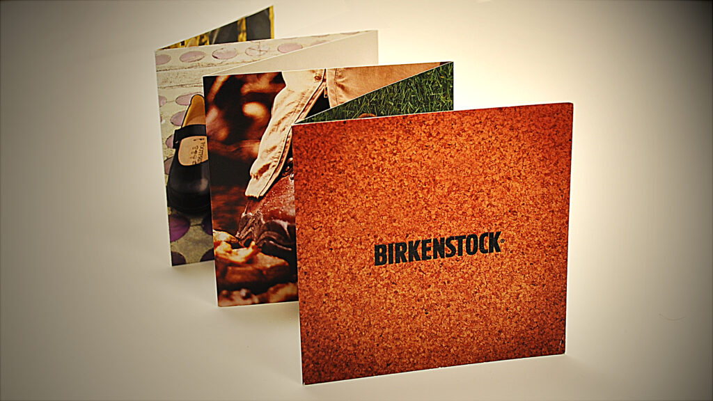
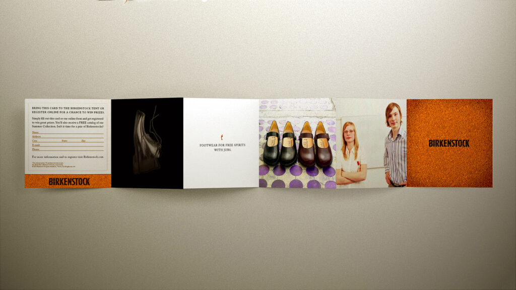
CHALLENGE: Birkenstock aimed to create a promotional item for distribution at major music festivals like Bonnaroo. They sought a compact and visually appealing piece that would be convenient to carry and convey Birkenstock’s brand positioning and help increase engagement with prospective customers.
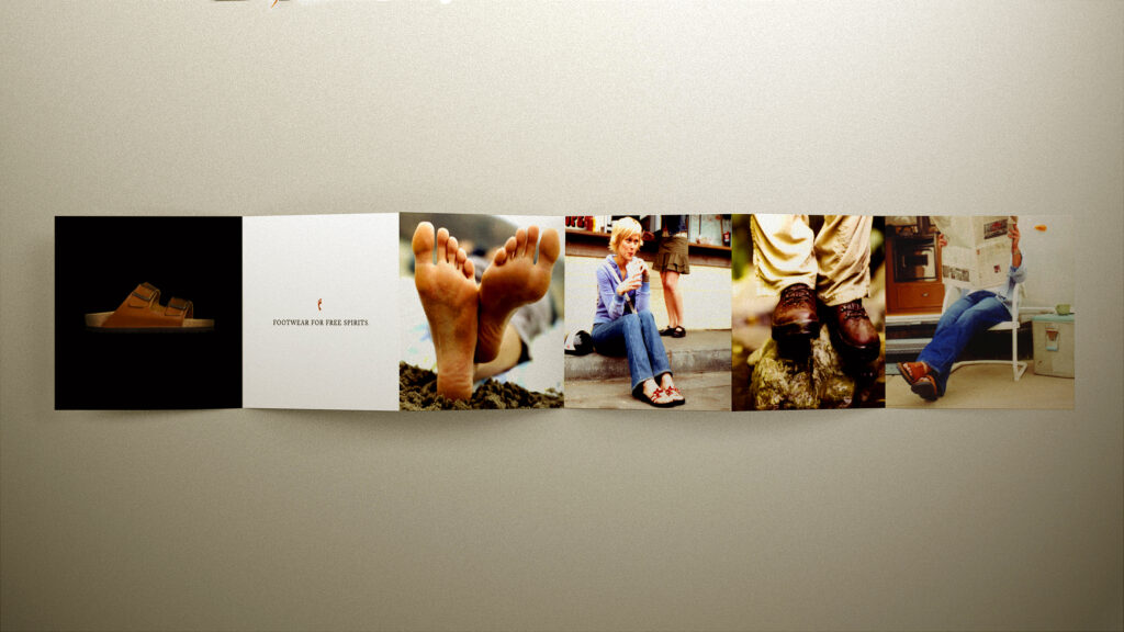
STRATEGY: We designed a compact, double-sided, and stylish 6-panel accordion-style brochure that effectively conveyed the brand’s positioning while highlighting new styles and included an incentive mechanism to capture prospect data and increase website traffic.
RESULT: Our strategy and execution proved to be a remarkable success, surpassing initial expectations regarding data collection and the subsequent increase in website traffic. We also triumphed in being able to revamp their aesthetic while adding new branding elements to their guidelines.
BIRKENSTOCK
Collateral
BIRKENSTOCK
Collateral Side 1
BIRKENSTOCK
Collateral Side 2
WE TV NETWORK
Branding / Design
OVERVIEW: WE TV is an American cable and satellite television channel primarily targeting female audiences with women-centric programming. It features a diverse range of shows, including reality series, dramas, and documentaries, often centered around relationships, family dynamics, and personal journeys. WE TV is known for shows like “Braxton Family Values,” offering viewers a mix of entertainment and insight into various aspects of women’s lives and relationships.
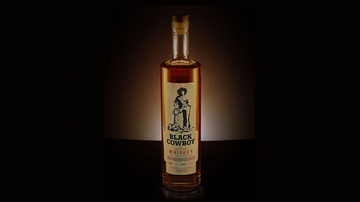
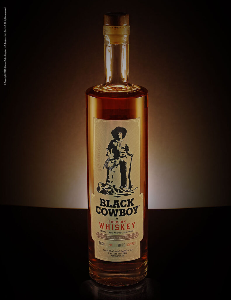
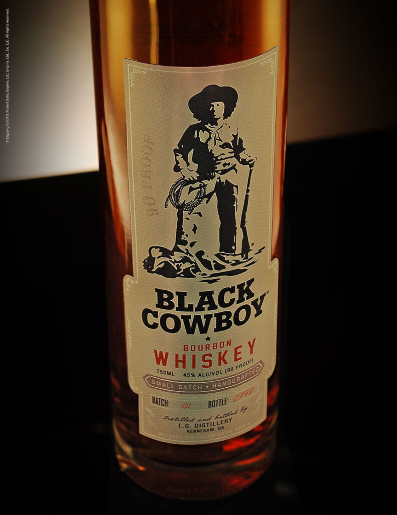
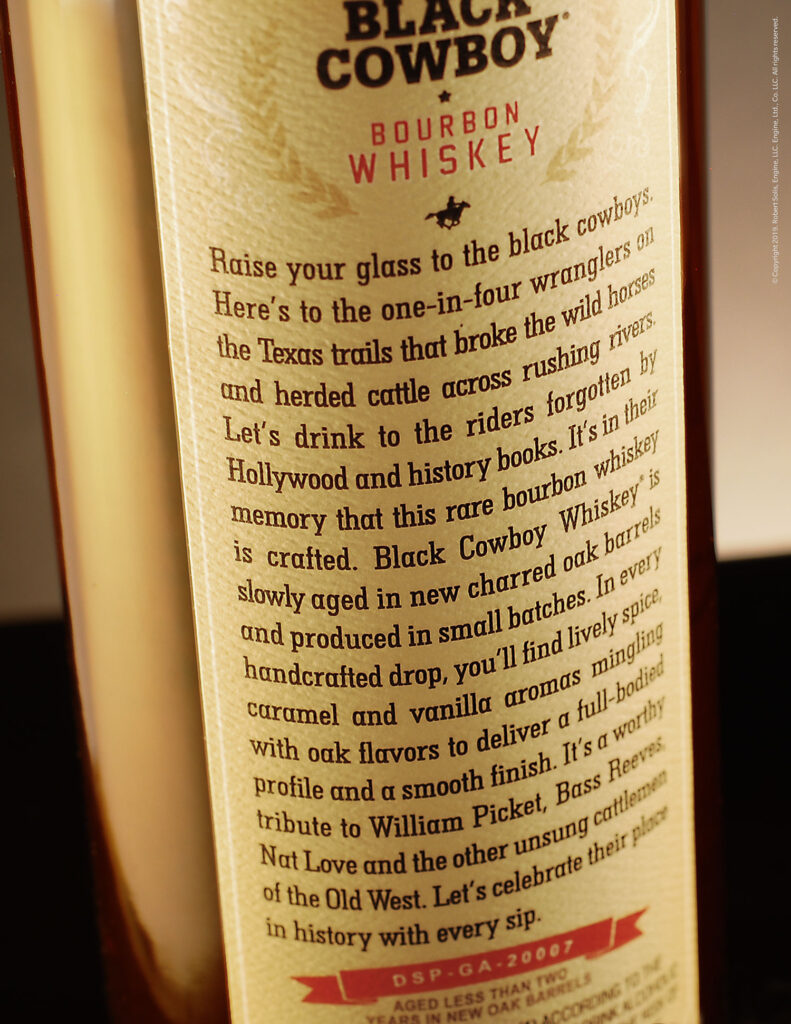
CHALLENGE: The highly popular show on WE TV, “Braxton Family Values,” needed to create the branding and packaging for a prop featured in one of their storylines. They were tasked with crafting the design for “Black Cowboy Whiskey,” a product set to play a significant role in the season’s narrative.
STRATEGY: We created the branding, copy and packaging for Black Cowboy Whiskey, drawing inspiration from the timeless whiskey tradition while building a brand rooted in the genuine stories of African-American cowboys from the Old West.
RESULT: The whiskey brand development was so successful that it produced several batches available for industry promotions and special events. This success also garnered significant investor interest in turning it into a tangible product soon to be produced for global distribution.
TRUEDIALOG
Branding / Design / Corp. ID.
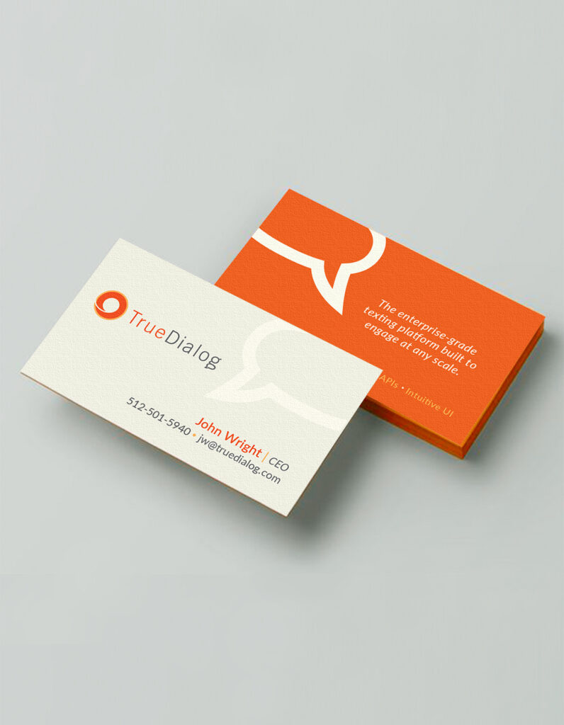
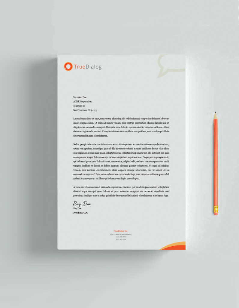
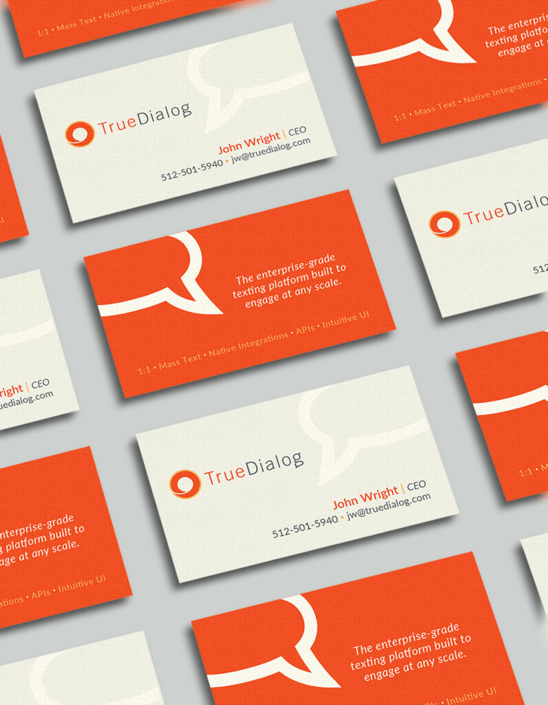
OVERVIEW: TrueDialog is a cloud-based communication platform that specializes in providing businesses with robust SMS and MMS messaging solutions. Offering a range of features such as mass texting, two-way messaging, and automated campaigns, TrueDialog enables organizations to engage with their customers and clients efficiently and securely. With a focus on compliance and scalability, TrueDialog caters to a variety of industries, including marketing, customer support, and education, helping them effectively manage and optimize their text-based communication strategies.
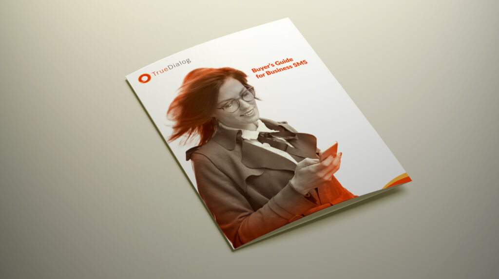
CHALLENGE: The company recognized the long period since its last branding update and sought to rejuvenate its image while preserving key elements that had defined its identity for years. Their primary goal was to infuse a fresh look into the brand while maintaining a sense of continuity and familiarity.
STRATEGY: We developed a fresh appearance by integrating new branding elements that reflected their product offerings and effectively communicated their core business. We took great care to ensure the branding was contemporary, easily legible, and visually appealing.
TRUEDIALOG
Corporate ID
TRUEDIALOG
Branding 1
TRUEDIALOG
Branding 2
TRUEDIALOG
Collateral
RESULT: The project was highly successful, allowing the brand to retain elements of its original aesthetic while introducing a fresh, rejuvenated and contemporary appearance that seamlessly integrated across all their materials and touchpoints.
ELVY LAB
Branding / Design / Corp. ID / Packaging
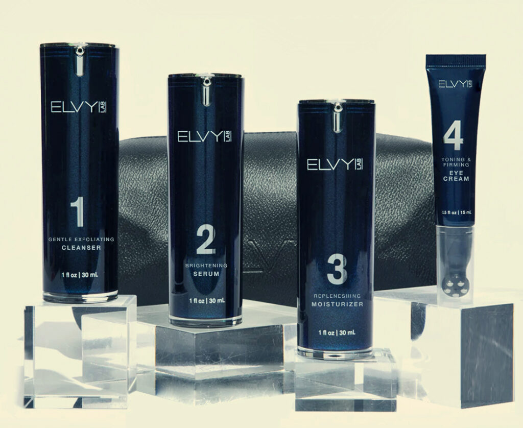
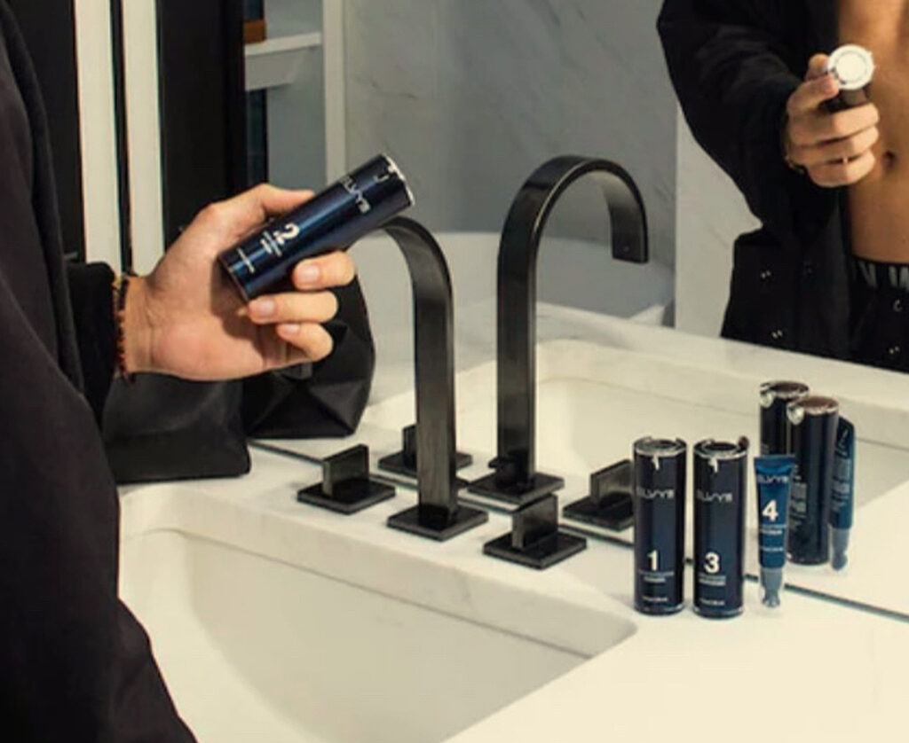
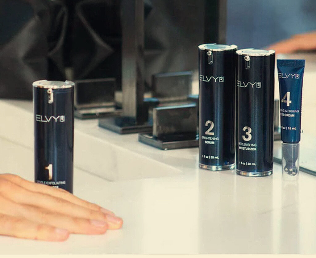
OVERVIEW: ELVY LAB is a groundbreaking skincare brand exclusively tailored for men, and it was founded by Lekha Vyas, a distinguished beauty industry veteran with over 15 years of expertise. Officially launched in 2022, ELVY Lab was established to simplify and redefine the way men approach their daily skincare and self-care routines, with the ultimate goal of helping them look and feel their absolute best.
CHALLENGE: ELVY LAB required comprehensive brand development, encompassing corporate identity, packaging design, and persuasive pitch materials to secure funding for their product concept. The project needed to be executed swiftly and efficiently to enable a launch in 2022.
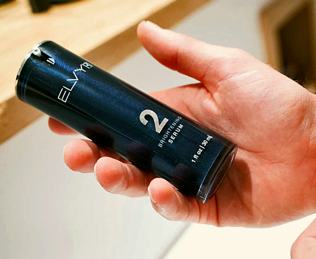
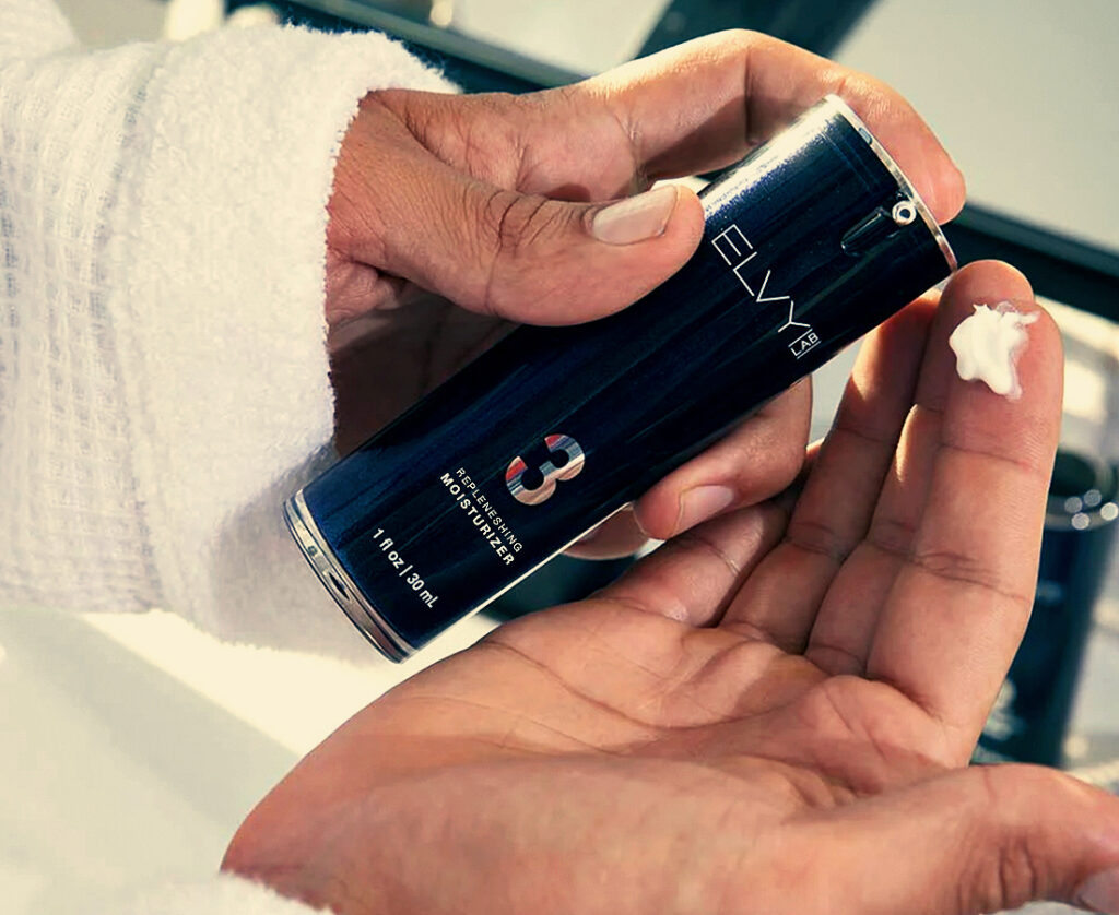
STRATEGY: We quickly created the branding and corporate identity for the company, seamlessly integrating it into their pitch materials. Additionally, we meticulously crafted the initial packaging designs, prioritizing simplicity and user-friendliness in the design process.
RESULT: The entire project was an immense triumph. ELVY LAB secured the essential funding, allowing them to enter the fiercely competitive cosmetics market with a strong presence, and they are now in the midst of a rapid growth phase.
FACT:
Statistics demonstrate the profound impact of branding and design on the success of a brand. According to a survey by Nielsen, 59% of consumers prefer to buy brands they are familiar with, emphasizing the importance of effective branding in building recognition and trust. Furthermore, research by the Design Management Institute found that design-driven companies outperformed the S&P 500 by 219% over a ten-year period, highlighting the financial impact of investing in design. In the digital age, where first impressions are often formed online, a study by Stanford University reveals that 75% of users judge a company’s credibility based on its website design, underscoring the pivotal role design plays in shaping consumer perceptions and maintaining a loyal base of followers and users.
branding & design • VID branding & design • branding & design • branding & design •
THE SAN FRANCISCO SYMPHONY
Branding / Collateral
OVERVIEW: The San Francisco Symphony is a renowned American orchestra celebrated for its exceptional musical performances and contributions to the world of classical music. Founded in 1911, it has established itself as a cultural cornerstone in the San Francisco Bay Area and beyond. With a rich history of artistic excellence and innovation under the leadership of renowned conductors, the orchestra continues to captivate audiences with its diverse repertoire and talent.
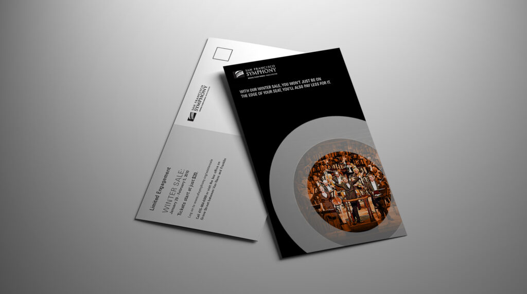
CHALLENGE: As the holiday season drew near, the San Francisco Symphony fell short of meeting its annual membership quotas. They urgently sought a direct mail creative strategy to reach their audience and secure membership subscriptions before the year’s end.
STRATEGY: We crafted a “Winter Sales Event” creative mailer highlighting the advantages of ticket purchases now over waiting. This eye-catching mailer was swiftly designed, produced, and distributed to specific target groups, effectively spreading the message to potential patrons.
RESULT: This project proved to be a significant triumph, not only filling all remaining membership slots but also becoming their highest-selling season to date.
STERLING VINEYARDS
Branding / Signage / Storytelling
OVERVIEW: Sterling Vineyards is a prestigious winery in the Napa Valley region of California, renowned for its exceptional wines and breathtaking hillside location. Founded in 1964, it has established itself as an icon of Napa Valley winemaking, offering a wide range of varietals, including Cabernet Sauvignon, Chardonnay, and Merlot. Sterling Vineyards is celebrated not only for its premium wines but also for its stunning architecture and aerial tramway, providing visitors with a unique and picturesque wine-tasting experience.
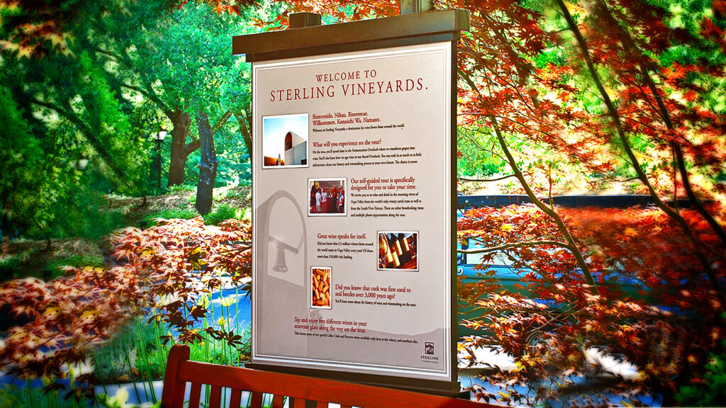
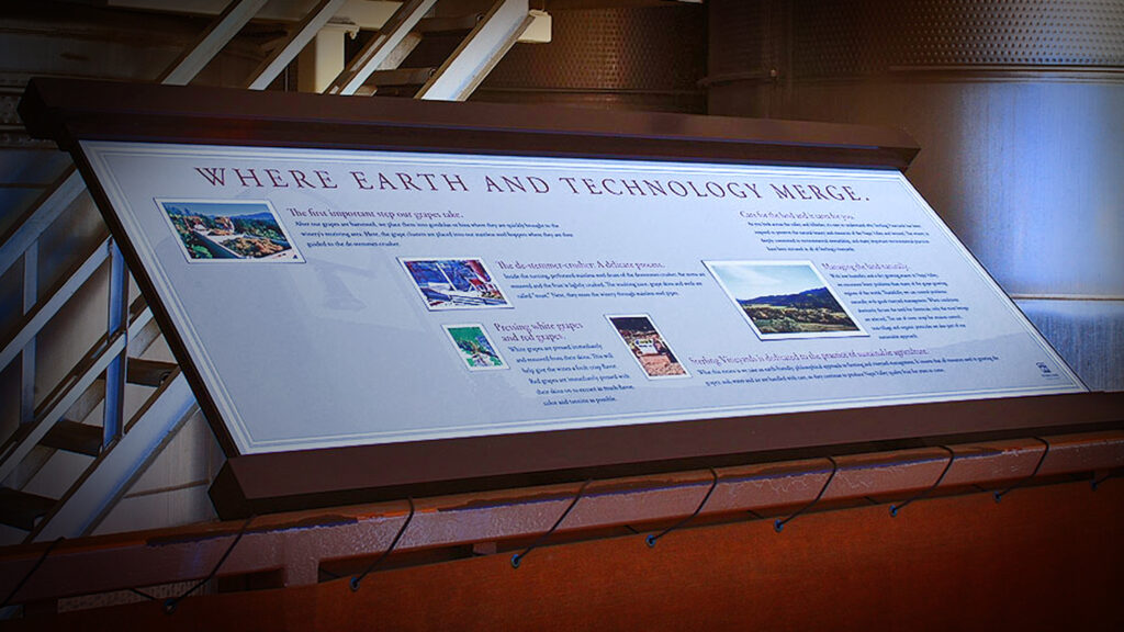
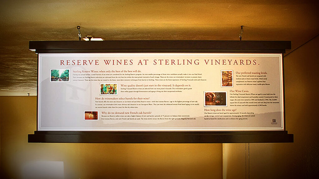
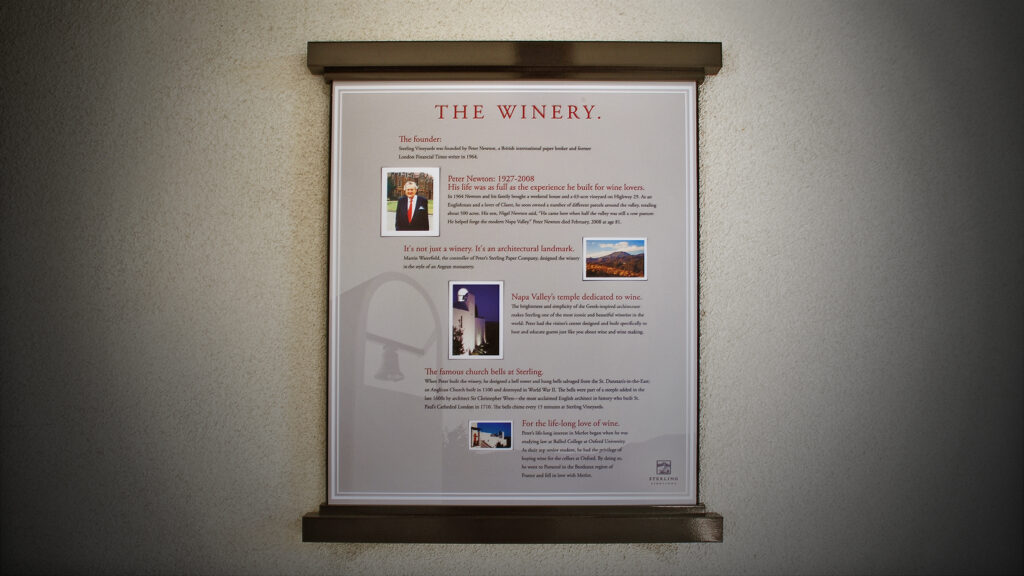
CHALLENGE: The winery recognized the need to modernize its outdated self-guided tour, characterized by aging informational signage that often left visitors uncertain about their path within the property. They aimed to overhaul all tour materials while ensuring alignment with their brand positioning.
STRATEGY: We crafted an extensive series of informational signage that was not only educational but also engaging and aligned with the brand. Also, we produced videos to work in tandem with the signage. This combined approach provided visitors with an exceptional self-guided tour experience.
RESULT: The project, despite its considerable scope and intricacy, achieved immense success by delivering the required updates that notably improved the winery’s visitor experience. This accomplishment ensured enduring enhancements for the satisfaction of both visitors and stakeholders.
STERLING VINEYARDS
Signage 1
STERLING VINEYARDS
Signage 2
STERLING VINEYARDS
Signage 3
STERLING VINEYARDS
Signage 4
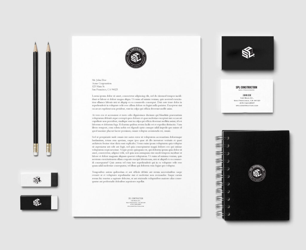
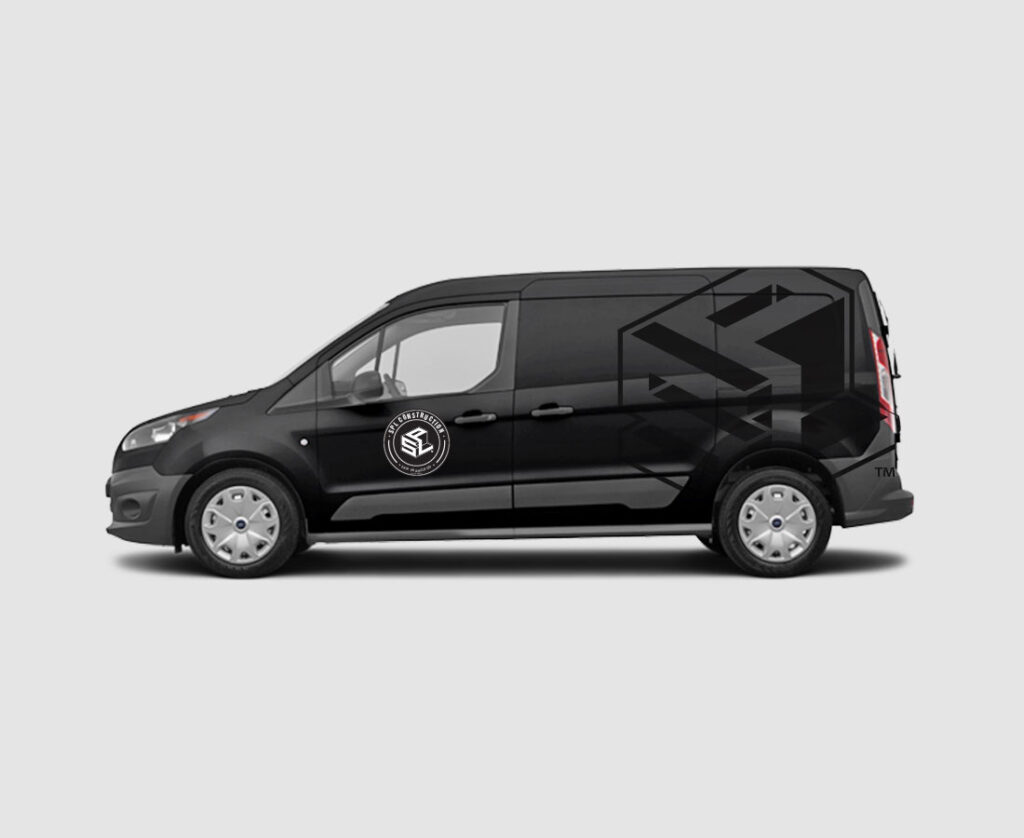
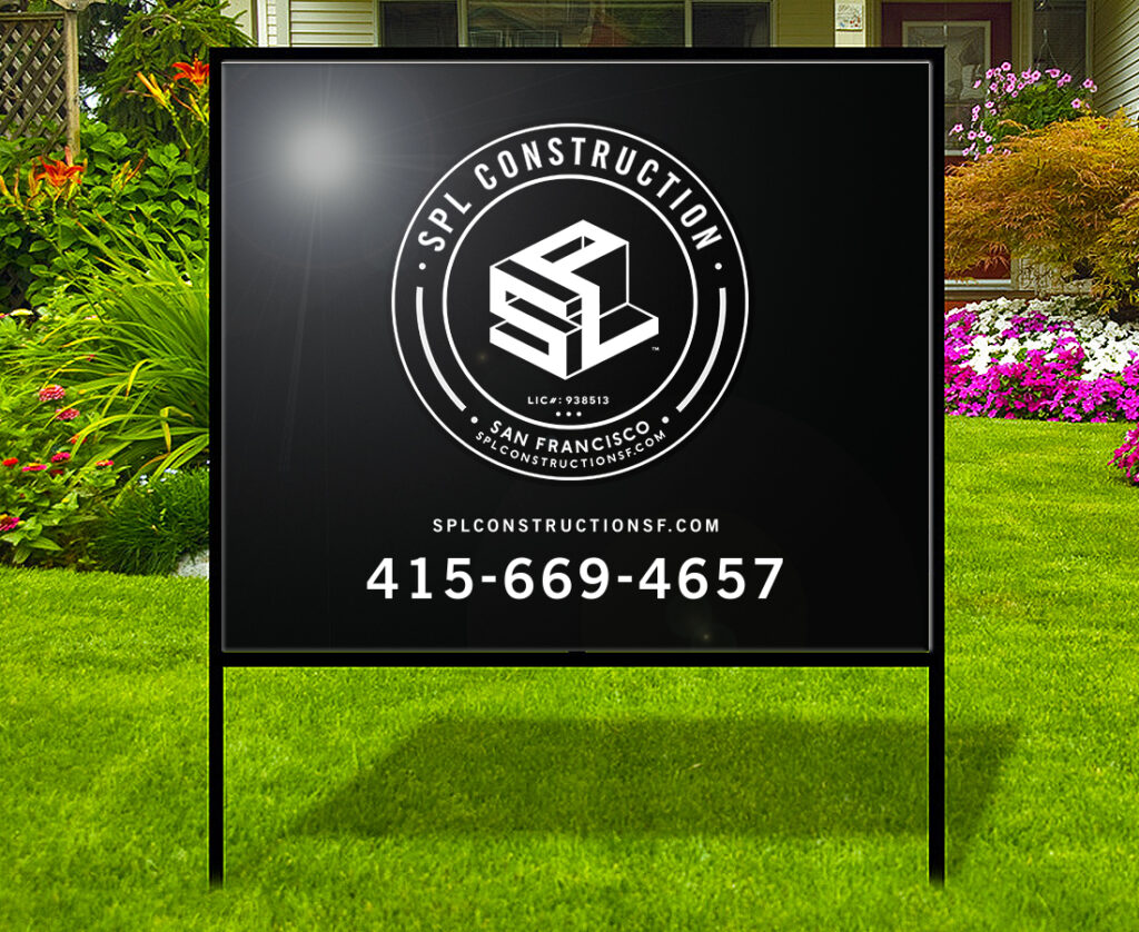
SPL CONSTRUCTION
Branding / Corporate ID
OVERVIEW: SPL Construction is a prominent construction company based in San Francisco, recognized for its expertise in delivering high-quality building and renovation projects. With a solid commitment to innovation, sustainability, and client satisfaction, SPL Construction has established itself as a trusted leader in the San Francisco construction industry.
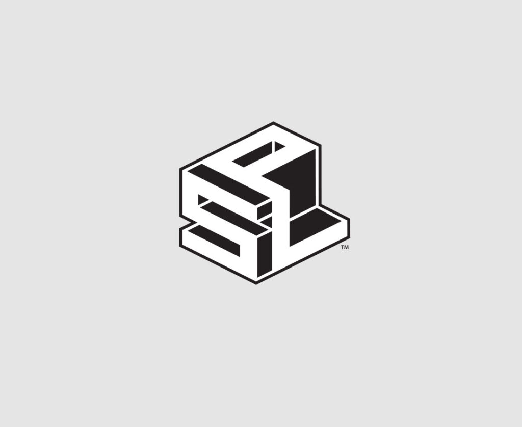
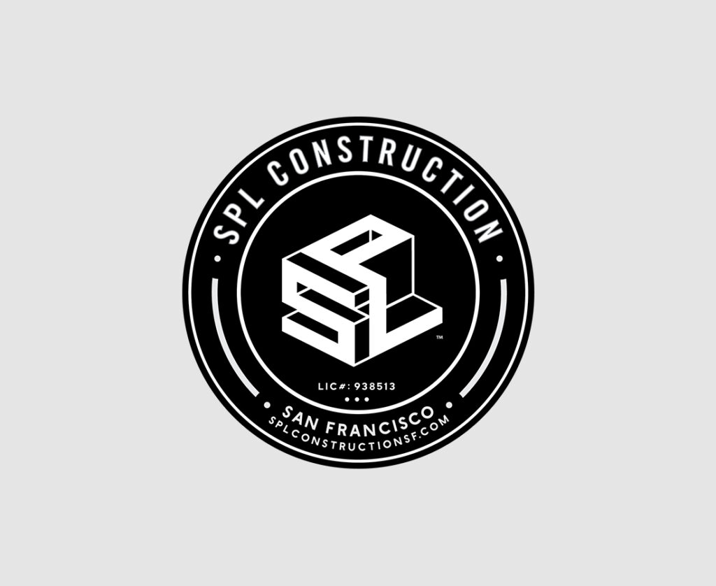
CHALLENGE: SPL Construction wanted a comprehensive rebranding initiative, aiming to refresh its corporate identity, which included a logo that effectively represented its offerings. Additionally, they sought an aesthetic mirroring the high-quality and elegant craftsmanship they consistently delivered.
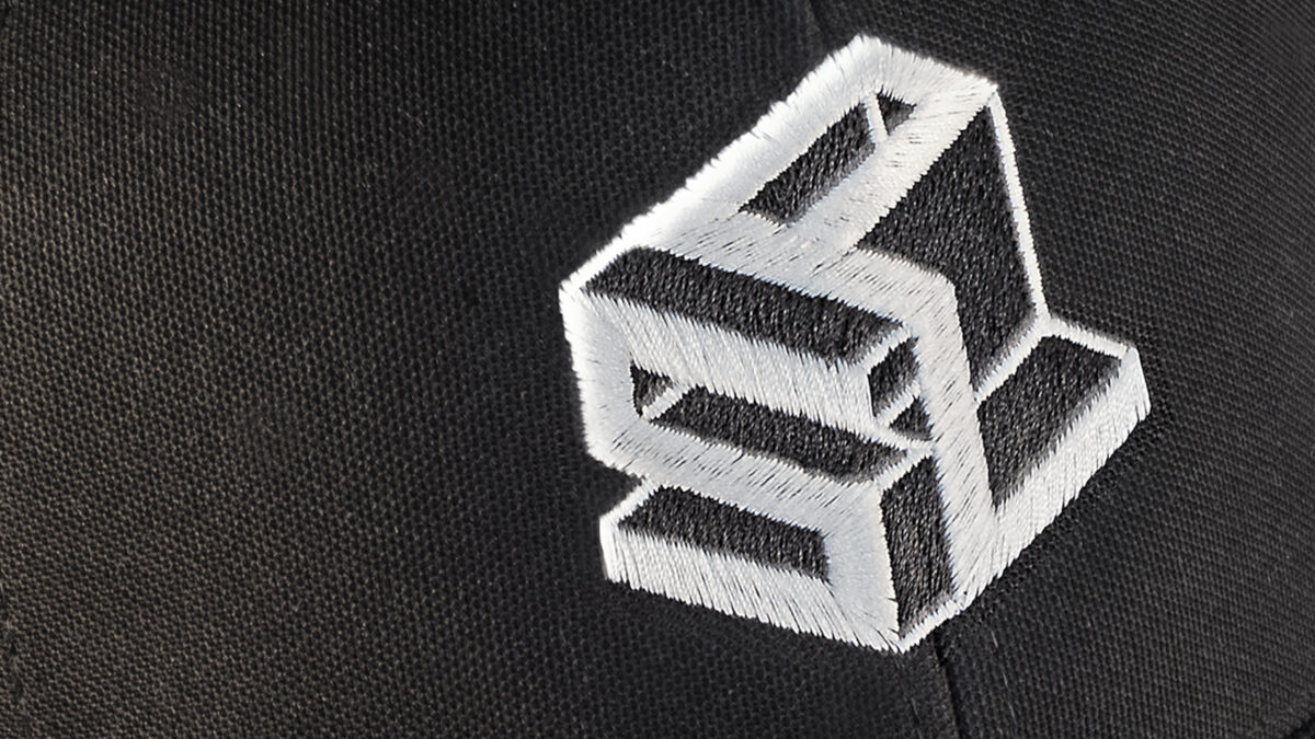
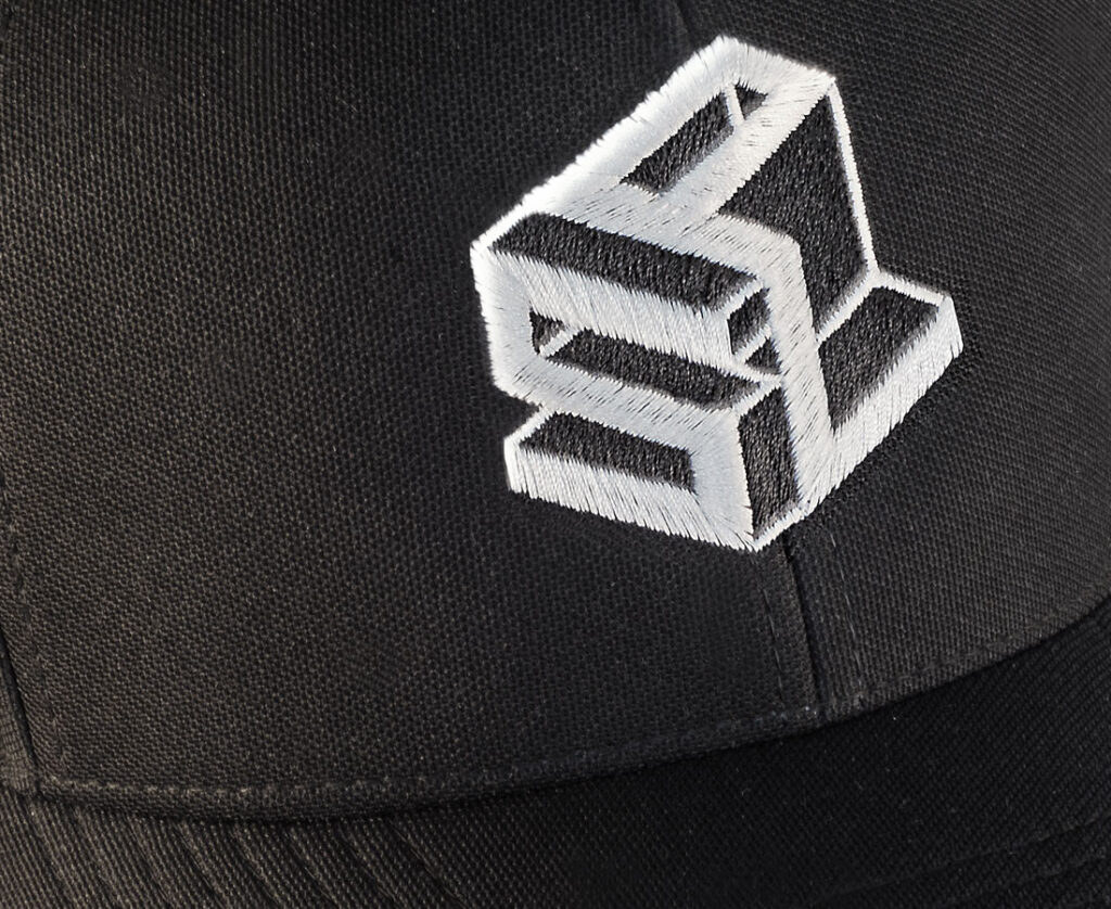
STRATEGY: We meticulously crafted a logo that succinctly conveyed their offering and attitude while establishing a new set of branding elements and a creative palette that seamlessly integrated across all customer touchpoints and internal communications.
RESULT: The project achieved resounding success with company leadership and stakeholders alike. The branding elements seamlessly found their place across various marketing channels, and the internal swag, highly coveted by both employees and customers, further contributed to its success.
MICROFOCUS
Branding / Collateral
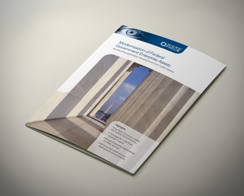
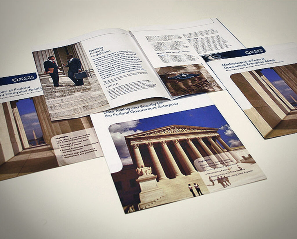
OVERVIEW: Micro Focus, Inc. is a software company renowned for its expertise in providing innovative technology solutions and software products to organizations worldwide. With a strong focus on helping businesses modernize their IT systems and maximize the value of their existing investments, Micro Focus plays a pivotal role in transforming the tech landscape and empowering enterprises to enhance efficiency, security, and agility while adapting to the ever-evolving demands of the digital age.
CHALLENGE: Microfocus needed to develop collateral materials for use at tradeshows and as informative takeaways that would embody their brand identity as a forward-thinking technology company, all while infusing a new and contemporary aesthetic into their branding.
STRATEGY: Drawing inspiration from the existing branding, we crafted a fresh identity that could seamlessly integrate across all their marketing materials. Furthermore, we developed the brand’s messaging and cultivated a tone conveying knowledge, trust, and innovation values.
RESULT: The outcome was a resounding triumph. The company embraced the new brand and effectively implemented it across all its materials, leading to a notable boost in brand recognition and increased lead conversion rates. The materials met enthusiastic approval from both sales and marketing leadership.

